

With the Check Box element, you can make interactive check boxes.
In your content you can check none, just one, or multiple check boxes of the same button group.
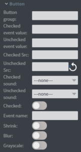 In the Button menu, you can set the name of your button group, a checked value, and an unchecked value.
You can set your element to be checked at the start of your content.
You can upload a checked and unchecked image here.
You can also shrink your element, blur your element, and make it make your element grayscale while it is unchecked.
The event name is not necessary to fill.
If the check value is empty but the checkbox has been checked it will get the default ‘Checked’ string.
You can set a checked and unchecked sound which will be played when the element goes to the checked/unchecked state.
Click here to read more about interactivity.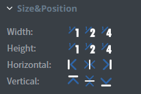 In the Size&Position menu, you can select the width, the height, and the placement of your element quickly.
Click here to read more about using size and position.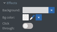 In the Effects menu, you can select a background image or colour for your element.
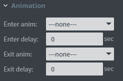 In the Animation menu, you can choose the enter and exit animation of your element.
Click here to read more about using animations.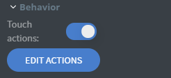 In the Behavior menu, you can set Touch actions for the element.
Click here to read more about touch actions.