
With the Carousel element, you can add an image gallery to your content.
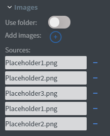
In the Images menu, you can select the images you want to display one by one or use a whole folder to display from.
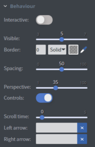
In the Behaviour menu, you can set the element to interactive and swipe between pictures on touch screens.
You can set the number of pictures shown at once, add a border and set the spacing and the perspective between pictures.
You can turn on and off the controls here.
You can also set the automatic scrolling time, and upload custom arrows here.
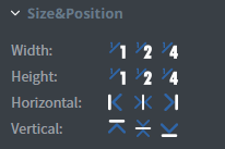
In the Size&Position menu, you can select the width, the height, and the placement of your element quickly.
Click here for more information about using size and position.
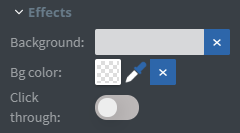
In the Effects menu, you can select a background image or colour for your element.
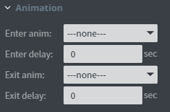
In the Animation menu, you can choose the enter and exit animation of your element.
Click here for more information about using animations.

You can use the Bind to data tool to select your datasource.
This menu will only appear if the Use folder function is turned on.
